How to Read the DOM Ladder: An Order-Flow Trading Guide
The DOM ladder (depth of market) shows resting bid/ask size, aggressive buy and sell volume, and per-level delta live. Learn to read walls and absorption.
If you have ever watched a price chart and wondered who is actually buying and selling at each tick, the DOM ladder is the answer. DOM stands for Depth of Market — a live, price-by-price ladder showing exactly how much resting limit-order size sits on the bid and the ask, and how much aggressive volume is trading into each level right now. It is the rawest read of supply and demand a screen can give you.
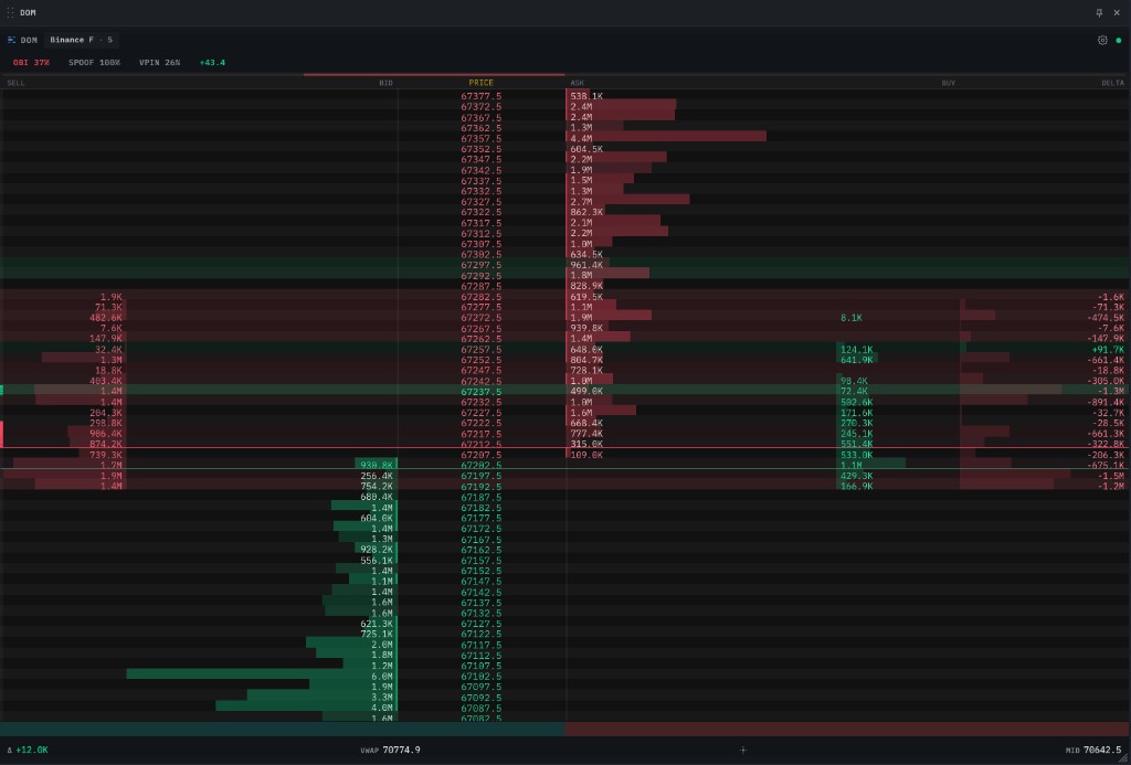 A live DOM ladder. Reading inward from the edges: aggressive SELL volume, resting BID size (green), the PRICE column, resting ASK size (red), aggressive BUY volume, and a signed DELTA column. Walls light up brighter; absorption tints amber.
This guide is the live-read companion to Trading Chart with Depth Heatmap: Complete Guide. The heatmap shows the history of the book over time; the DOM ladder shows the book right now. Read both for the full picture.
What is a DOM ladder?
Every limit order resting on an exchange sits at a price, waiting to be filled. The bid is the highest price a buyer will pay; the ask is the lowest price a seller will accept; the mid is the midpoint between them. The DOM ladder stacks every price level vertically and shows you, for each one:
- Resting size — how many contracts or coins are queued as limit orders at that price.
- Aggressive volume — how much market-order flow (traders crossing the spread to get filled now) has hit that price recently.
A normal candlestick tells you where price went. The DOM ladder tells you what it had to get through to go there — and what is waiting above and below right now. That is the difference between reading the result and reading the cause.
Reading the columns
A professional DOM ladder is laid out symmetrically around a central PRICE column, with resting size on the inside and aggressive volume on the outside. Reading from left to right in the screenshot above:
SELL (aggressive sell volume)
The leftmost column. Each number is how much market-sell volume has executed at that price over a recent rolling window — traders hitting the bid to get out now. A red profile bar scales with the size so you can spot heavy selling at a glance without reading every number.
BID (resting bid size)
Green. This is the limit-buy size queued below the current price — passive demand. The green bar grows toward the price column with the size. Big green bars are levels where buyers are waiting; the bigger and more persistent, the more meaningful as support.
PRICE
The ladder spine. The last traded price is highlighted so your eye always knows where the market is. The best bid and best ask — the top of each queue — frame the live spread. Everything above the spread is the ask side; everything below is the bid side.
ASK (resting ask size)
Red. The limit-sell size queued above price — passive supply. The red bar grows toward the price column. Big red bars overhead are levels where sellers are waiting; persistent ones act as resistance.
BUY (aggressive buy volume)
Green. The mirror of the SELL column — how much market-buy volume has lifted the ask at each level recently. A green profile bar scales with it. Heavy green here means buyers are aggressively taking offers.
DELTA (per-level imbalance)
The signed difference between aggressive buy and aggressive sell volume at each price — buy minus sell. Positive (green) means buyers hit harder at that level; negative (red) means sellers did. A column of green deltas climbing a move is momentum confirmation; deltas flipping against the move is your early warning.
The header readouts
Above the ladder sit a few one-glance order-flow gauges:
- OBI — Order Book Imbalance. How lopsided resting liquidity is between the bid and ask side. Heavily bid-skewed often precedes an upward push; ask-skewed, a drop.
- SPOOF. How much of the visible book is flickering — appearing and vanishing without being filled. A high reading is a warning that the walls you see may be fake.
- VPIN — flow toxicity. How one-sided recent traded volume is. High toxicity means informed, directional flow is in control; low means two-sided, choppy conditions.
You do not need to master the math behind these. Treat them as a quick sentiment frame before you read the ladder itself.
The trade trail
The thin strip on the far left edge prints recent trades as dots coloured by side (buy vs sell), top-to-bottom matching the ladder. It is a tape-reading shortcut: a run of same-coloured dots marching up or down is a live aggression streak.
Reading the row backgrounds (green vs red rows)
The coloured wash behind each price row is a separate signal from the column bars, and it is the one that confuses people most at first. It tints every level by which side was the dominant aggressor there over a recent rolling window:
- Green row — buyers were the net aggressors at that price (more market-buy volume than sell).
- Red row — sellers were the net aggressors.
- No tint — roughly two-sided or quiet; neither side clearly won that level.
The intensity scales with how lopsided the level was — a faint green is a mild buy lean, a strong green is a level buyers dominated. It is the at-a-glance version of the DELTA column: same idea (buy vs sell aggression per price), read as colour instead of a number.
Because it reflects recent flow, the wash repaints as the tape evolves — a row can flip from green to red as the battle at that price changes hands. Do not read a single row in isolation; read the pattern of where green and red cluster.
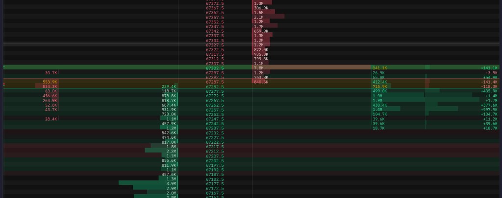 Mixed green/red row backgrounds. Each row is tinted by the side that was more aggressive at that price recently. Read the clustering, not the individual rows.
The cases you will actually see
Mixed green and red with no clear cluster (like the screenshot above). The tape is balanced and choppy — both sides are trading actively but neither is winning the range. This is a low-conviction, stand-aside or scalp-the-extremes condition. Do not force a directional trade into a two-sided book.
Green cluster below price, red cluster above. Buyers are defending the levels beneath the market and sellers are capping the levels above — a textbook range. Fade the edges: buy into the green floor, sell into the red ceiling, until one side breaks.
A run of green rows marching up with price (or red rows marching down). Aggression is aligned with direction — a healthy trend. The dominant side keeps winning each new level as price advances. Trade with it; pullbacks into the trend are continuation entries.
The tint disagrees with price direction. Price is grinding up but the rows keep printing red (sellers aggressive into every tick), or price is dropping while rows stay green. This is the warning sign — the move is happening despite the aggression, which means a passive wall is absorbing it. Pair this with the DELTA column flipping and you have a high-quality reversal heads-up. (See Absorption and The imbalance flip below.)
An amber row. Not part of the green/red scale — amber flags absorption: a level where heavy aggressive volume is being soaked up by a resting order that won't break. It is the single most important row to watch when it appears against the prevailing move.
Don't confuse these with the other row markers
Three more background cues are easy to mistake for the dominance wash:
- The brightest side-tinted band is the last traded price (LTP) — green if the last trade was a buy, red if a sell. It marks where the market is right now, not a dominance level.
- The thin green and red horizontal lines near the centre are the best bid (green, below) and best ask (red, above). The gap between them is the live spread.
- Faint alternating stripes across the whole ladder are just row guides to help your eye track across columns — ignore them as signal.
The four patterns that matter most
Once you can read the columns, the ladder starts telling stories. These four show up on BTC/USDT every single session.
1. The resting wall
What you see: an unusually large bid or ask size that dwarfs its neighbours and stays put as price approaches.
What it means: a participant with size wants to defend that level. The first test of a real wall almost always bounces. Walls are public — every algo can see them — so the market collectively decides to either get absorbed or wait for the wall to pull.
The single most actionable event is a wall disappearing. When a large resting order that has held suddenly vanishes from the ladder as price arrives, the holder no longer wants to defend it — and price usually runs through within seconds.
2. Absorption
What you see: heavy aggressive volume (a fat SELL or BUY column) pounding into a resting level, but price refuses to move through it. On a good ladder this level tints amber to flag it.
What it means: the limit order on the other side is soaking up everything. If sellers are throwing size at a bid and the bid keeps refilling without breaking, a large buyer is absorbing the sell pressure. Absorption against the prevailing move is one of the strongest reversal tells in microstructure — you are watching aggression fail.
Trade read: when you see sellers exhaust themselves into a bid that won't break, the bounce that follows is high-conviction because the aggressors have already spent their ammunition.
3. The imbalance flip
What you see: the DELTA column and OBI readout, which were one-sided in the direction of the move, suddenly flip.
What it means: the aggressors driving the move are losing control. A rally where every level printed positive (green) delta, then starts printing red deltas into overhead asks, is a rally running out of buyers. This is your early exit signal — often several ticks before the candle chart shows weakness.
4. The sweep through a thin book
What you see: a price range with almost no resting size on either side — small or empty bars — sandwiched between two walls.
What it means: nothing is there to absorb flow. A single decent market order can rip price through the whole thin zone in seconds because there is no opposing liquidity to slow it. Thin books point to where price wants to go next; breakouts through them are the highest-probability continuation moves on the ladder.
DOM ladder vs heatmap vs footprint — when to use each
These three order-flow views answer different questions. Use them together, not interchangeably:
| View | Answers | Best for |
|---|---|---|
| DOM ladder | What is resting and trading right now, per price | Live entries, absorption, spotting walls being pulled |
| Orderbook heatmap | How the book evolved over time | Seeing walls form, persist and pull; mapping support/resistance history |
| Footprint chart | Buy vs sell volume inside each finished candle | Confirming who won each bar; stacked imbalances; exhaustion |
A common professional workflow: map the key levels from the heatmap, read who is winning each bar from the footprint, then pull the trigger off the DOM ladder the instant you see absorption or a wall pull at one of those levels.
Common mistakes
Trusting size you have not seen consumed. A giant wall means nothing until aggressive volume actually hits it and it holds. Spoofers place large orders far from price precisely to be seen, then pull them. If the SPOOF readout is high, distrust the walls — wait for size to trade into a level before you treat it as real.
Reading the ladder in isolation. The DOM tells you the immediate balance of force, not the broader context. A bid wall is support only if it sits where the heatmap and structure agree it should. Without that context you will fade strong trends into walls that are about to get pulled.
Trading every flicker. The book updates many times a second. Most of that motion is noise — algos repricing, small orders shuffling. Anchor on persistent size and completed aggression (the rolling SELL/BUY columns and the delta), not on every twitch of the top of book.
Ignoring the delta when it disagrees. If price is making new highs but the DELTA column is printing red into the asks, believe the delta. Aggressive flow turning against a move is an earlier and more honest signal than the price line itself.
Using too fine a tick on a fast market. Aggregating to a coarser price grouping makes walls and absorption far easier to read on a volatile pair. A ladder where every row has a sliver of size hides the levels that matter.
Where to go from here
The fastest way to internalise the ladder is to watch a live BTC/USDT DOM during a high-activity session — the New York open (12:30 UTC) and the Asia open (00:00 UTC) both reliably produce walls being pulled, absorption, and thin-book sweeps. Within two weeks of short daily sessions, the patterns become automatic.
- Trading Chart with Depth Heatmap: Complete Guide — the history view that pairs with the live ladder.
- How to Read an Orderbook Heatmap for Trading — the five wall/spoof/iceberg patterns drawn over time.
- What Is a Footprint Chart? Complete Guide — buy vs sell volume inside each candle, the third dimension of order flow.
- Trading with the CVD Profile — cumulative volume delta, the bigger-picture aggression read behind the per-level delta column.
Want to try it on live data? The DOM ladder, depth heatmap, footprint and CVD profile are all on the live chart terminal, and the 30-day trial unlocks every layer mentioned here — see the pricing page for the plan matrix.
This article is education, not financial advice. Trading involves risk.