Trading Chart with Depth Heatmap: Complete Guide [2026]
Learn how a trading chart with depth heatmap visualises real-time orderbook liquidity behind candlesticks. Patterns to read, tools that support it, and a 50-line JavaScript implementation.
A traditional candlestick chart shows you where price went. A trading chart with depth heatmap shows you where price is going to react — the resting limit orders, the institutional walls, the spoofing, the iceberg orders that traditional charts make invisible.
If you have ever wondered why a candle suddenly reverses at a price level that has no visible support, the answer is on the depth heatmap. This guide explains exactly what a depth heatmap is, how to read it, which tools render it inside a single canvas, and how to embed one in your own application in under 50 lines of code.
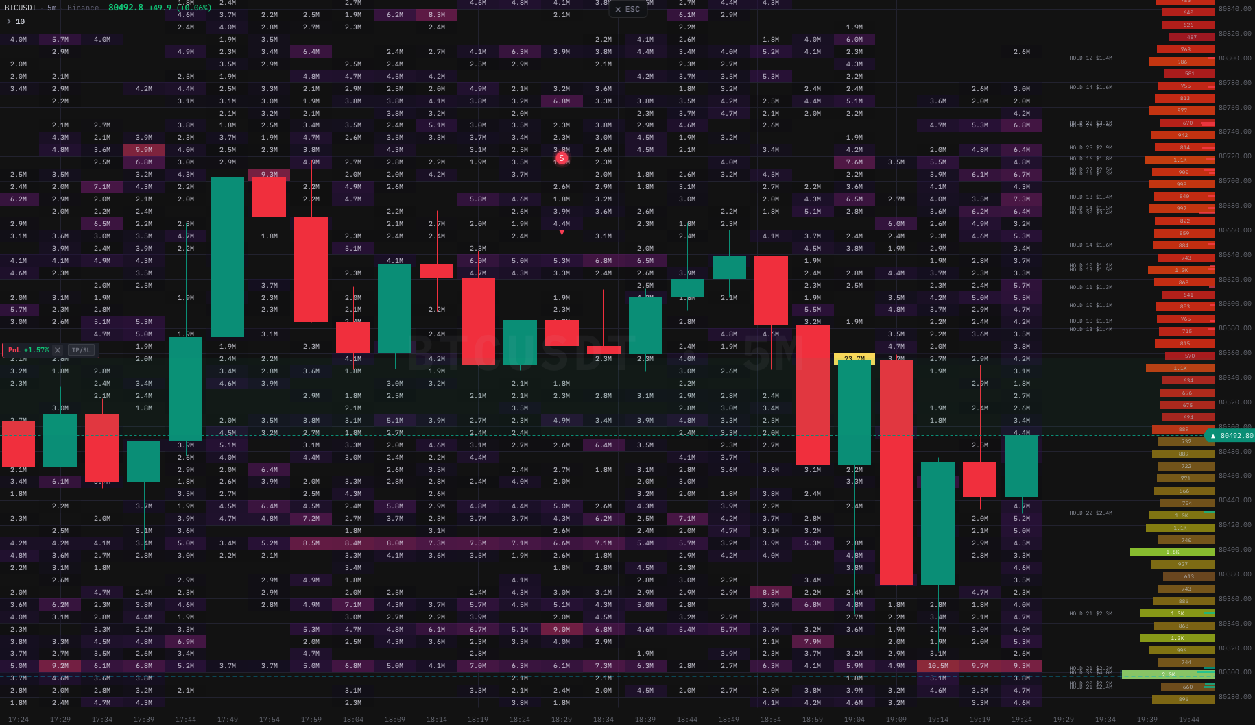 BTC/USDT — candlesticks with real-time orderbook depth heatmap, large trade bubbles, liquidation heatmap, and RSI signals — all in one canvas, rendered by the
 kline-orderbook-chart native engine.
What is a depth heatmap on a candlestick chart
A depth heatmap is a colour-coded visualisation of the orderbook's resting limit orders, plotted on the same time and price axes as the candlestick chart. Each pixel maps to a (price level, time column) cell. The colour intensity at that cell represents the liquidity sitting at that price at that point in time.
Bright orange or red areas mean a large quantity of limit orders was resting at that price. Dark areas mean nothing was there. When you overlay this heatmap behind the candles, you suddenly see two things at once:
- Where price was — the candles (executed trades).
- Where the resting liquidity was — the heatmap (limit orders waiting to be hit).
The combination is the closest thing a screen trader can get to the institutional view of the market, which is why prop firms have paid thousands per month for legacy desktop platforms since the early 2010s.
Why traditional charts miss 95% of market activity
A candlestick aggregates four numbers per bar: Open, High, Low, Close. Optionally a fifth: Volume. That is the entire information density of every charting library released between 1999 and 2020.
What the candle does not show:
- The 50 BTC limit-sell wall at $68,500 that has been sitting there for the last three hours.
- The iceberg buyer at $66,800 quietly refreshing 5 BTC every minute.
- The spoofed 200 BTC bid that vanished the moment price approached.
- The thin liquidity zone between $67,200 and $67,800 where a single market order could move price 60 dollars.
All of this lives in the orderbook depth, not in OHLCV. And until recently, the only way to see it was to either:
- Run a Windows-only desktop application built for institutional traders, or
- Stare at a Level 2 ladder and try to remember what was there 30 seconds ago.
A depth heatmap solves both problems by persisting historical orderbook snapshots as a coloured raster behind the price chart. Now the iceberg refresh history is visible at a glance, and so is the wall that has been defending $68,500 for the last three hours.
How a depth heatmap is built (the matrix model)
Under the hood, a depth heatmap is a two-dimensional matrix indexed by:
- Rows → price levels, evenly spaced (e.g. 200 rows × $5 = $1,000 of price range).
- Columns → time columns, one per bar (e.g. 500 columns × 1 minute = 500-minute window).
Every cell (row, col) holds a single floating-point number: the liquidity at that price during that time bucket. The renderer maps the number to a colour through a palette (typically dark blue → cyan → yellow → orange → red), and draws the cell as a filled rectangle on the canvas.
// Conceptually, a heatmap is just a flat Float64Array.
// matrix[row * cols + col] = liquidity at (price_min + row * yStep, time_col)

const rows = 200      // price levels
const cols = 500      // time columns
const matrix = new Float64Array(rows * cols)
const yStep = 5       // $5 per row
const priceMin = 60000

// Real-time update: a new orderbook snapshot arrives
function onOrderbookSnapshot(snapshot, columnIdx) {
  for (const { price, qty } of snapshot.bids.concat(snapshot.asks)) {
    const row = Math.floor((price - priceMin) / yStep)
    if (row < 0 || row >= rows) continue
    matrix[row * cols + columnIdx] = qty
  }
}
The performance bottleneck is the render, not the data. A 200×500 matrix is 100,000 cells. Drawing 100,000 <div>s would be impossible at 60 fps, which is why every serious depth heatmap library renders to a <canvas> element with a single putImageData() call per frame.
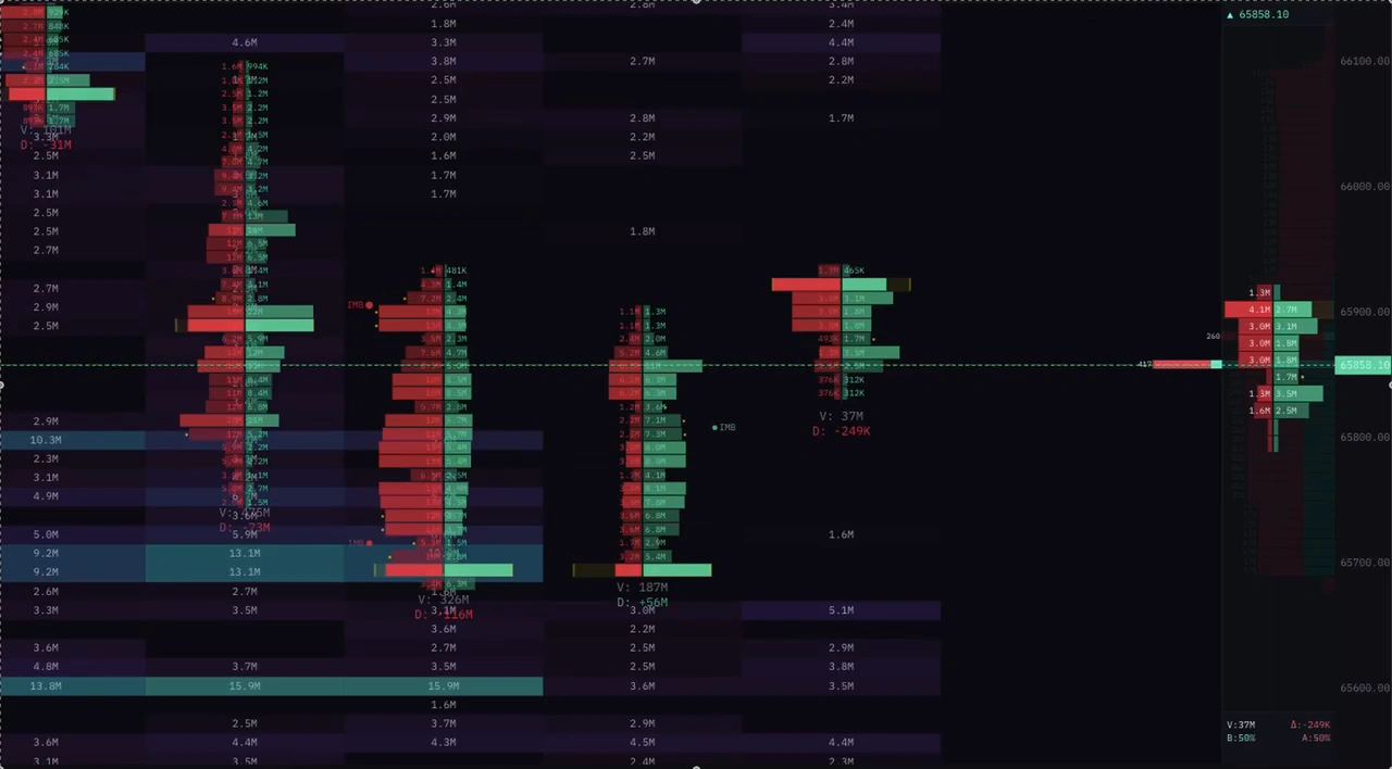
Live capture of kline-orderbook-chart streaming a Binance Futures depth stream. Watch the resting walls form, the spoofs flash and disappear, and the price reacting to liquidity gaps in real time.
Reading the heatmap: five patterns you can spot in 30 seconds
The first time you look at a depth heatmap, the colours feel chaotic. After a few hours, you start seeing the same five patterns over and over. Here they are.
1. Resting walls (support/resistance built in real time)
A horizontal bright stripe that persists across many columns means a large limit order has been sitting at that price for a long time. This is the strongest support/resistance signal a chart can give you: the market is literally telling you where someone is willing to absorb size.
When the stripe disappears mid-stream (the wall is pulled), it usually means whoever placed it is no longer defending that level, and price tends to break through within seconds. Pulling a wall is the most reliable "breakout incoming" signal in microstructure trading.
2. Spoofing flashes
A bright stripe that appears for less than 30 seconds and disappears before price reaches it is a spoof. Spoofing is illegal in regulated markets but extremely common in crypto. The spoofer's goal is to scare retail into the opposite direction by faking a wall.
A trading chart with depth heatmap is the only tool that exposes spoofs without you sitting on the Level 2 ladder 24/7. Once you have spotted three or four spoofs at the same price level, you have identified the spoofer's algorithm and can fade them.
3. Iceberg refresh patterns
An iceberg order is a large hidden order broken into small visible slices that refill as they execute. On a depth heatmap, this shows up as a horizontal dotted line at a single price level: every time the visible slice is consumed, a new slice appears, then is consumed, then appears, all in the same row.
If you see a dotted line at $66,800 lasting 20 minutes, there is a serious buyer at that price. Stops below $66,800 are about to get harvested, and the price is more likely than chance to bounce.
4. Liquidity vacuum zones
A dark band between two bright bands is a liquidity vacuum: a price range with very few resting orders. When price enters a vacuum, it moves fast — a single market order is enough to drive it through, because there is nothing to absorb the flow.
The classic setup is "wall at $68,500, vacuum from $67,200 to $68,000, wall at $67,000". If price breaks $68,500, it will not stop until $67,000 (or whatever the next wall is). The chart literally shows you the path of least resistance before it happens.
5. Stacked accumulation
Multiple closely spaced bid stripes below the current price (or ask stripes above) indicate stacked accumulation — a buyer building a ladder of limit orders to defend a zone. This is typical of market makers or large discretionary traders trying to fill size without slipping the market.
Stacked accumulation is the strongest trend-continuation signal a depth heatmap gives. If the buyer keeps stacking even as price ticks down, you know the dip is being bought, not panicked.
Tools that render orderbook depth as a heatmap
Roughly four categories of tool can render a real depth heatmap, and most chart libraries you have heard of do not belong in any of them:
- Windows-only desktop applications built for professional traders. Powerful, expensive, native-code. Not embeddable in a web product.
- Multi-OS desktop platforms targeting professional traders. Similar profile to the Windows-only tools, broader OS support, similar price band.
- Web SaaS products that sit between desktop and library — you pay a monthly fee and use the vendor's hosted chart through an iframe or a hosted app. Convenient; you do not own the integration.
- JavaScript / TypeScript libraries that ship as an npm package and render inside your own product. This is the only category that lets you build a trading app around the chart instead of into somebody else's product.
Within the JavaScript library category, the technical requirements are sharp: real-time append on a 100,000-cell heatmap matrix without DOM thrash, candles overlaid on the same canvas, synchronised pan/zoom/crosshair, indicator extensibility, and a trade-tape ingestion path so footprint cells render inline once the customer asks. If a library cannot do those things, the demo looks great and the production deploy breaks the moment a real WebSocket starts pumping data.
We are the team behind kline-orderbook-chart, an npm package built specifically for this slot. The library ships a 380 KB gzipped native engine doing the rendering, with a framework-agnostic JavaScript API on top. It is one possible answer; the buyer's guide below tells you how to evaluate every candidate honestly. See Choosing an Orderbook Heatmap Chart Library: A Practical Buyer's Guide for 2026 for the 14-dimension rubric you can run on any shortlist.
A 50-line implementation you can copy-paste
The full code below renders a candlestick chart with an orderbook heatmap behind it, using real Binance Futures depth data. Save it as index.html, open in a browser, you are done.
<!DOCTYPE html>
<html>
<head>
  <title>BTC/USDT depth heatmap demo</title>
  <style>html,body,canvas{margin:0;width:100%;height:100vh;background:#0B0E11}</style>
</head>
<body>
  <canvas id="chart"></canvas>
  <script type="module">
    import { createChartBridge } from 'https://esm.sh/kline-orderbook-chart'

    const canvas = document.getElementById('chart')
    const chart = await createChartBridge(canvas, {
      // Omit licenseKey to run the 30-day trial with a watermark.
      // licenseKey: 'YOUR_TRIAL_KEY',
      theme: 'dark',
    })

    // 1) Load historical klines for the candle layer.
    const r = await fetch('https://api.binance.com/api/v3/klines?symbol=BTCUSDT&interval=5m&limit=500')
    const klines = (await r.json()).map(k => ({
      time: k[0] / 1000, open: +k[1], high: +k[2], low: +k[3], close: +k[4], volume: +k[5],
    }))
    chart.setKlines(klines)

    // 2) Allocate the heatmap matrix: 200 price rows × 500 time columns.
    const rows = 200, cols = klines.length
    const priceMin = Math.min(...klines.map(k => k.low))
    const priceMax = Math.max(...klines.map(k => k.high))
    const yStep = (priceMax - priceMin) / rows
    chart.setHeatmap({
      rows, cols, priceMin, yStep,
      matrix: new Float64Array(rows * cols),
    })

    // 3) Stream real-time orderbook depth from Binance Futures.
    const ws = new WebSocket('wss://fstream.binance.com/ws/btcusdt@depth20@100ms')
    ws.onmessage = ev => {
      const { b: bids, a: asks } = JSON.parse(ev.data)
      const colIdx = cols - 1
      for (const [p, q] of bids.concat(asks)) {
        const row = Math.floor((+p - priceMin) / yStep)
        if (row >= 0 && row < rows) chart.updateHeatmapCell(row, colIdx, +q)
      }
    }

    // 4) Start the render loop. 60 fps, GPU-accelerated, ~3% CPU.
    chart.start()
  </script>
</body>
</html>
Open the HTML file, and within five seconds you have a fully functional trading chart with a real-time orderbook depth heatmap. No npm install, no build step, no React or Vue. The same chart works inside any framework — see the React integration guide and the Vue 3 integration guide for production setups.
Common questions
Does this work for spot, futures, or options? Spot and futures, on any exchange that exposes a depth stream. Options orderbooks are sparse and the heatmap is less useful — most options trading uses chains rather than depth visualisation.
What is the difference between a depth heatmap and a market depth chart? A market depth chart (sometimes called a "depth chart" or "DOM chart") shows the current orderbook as a single snapshot — usually a cumulative quantity curve at this exact moment. A depth heatmap shows historical depth over time. The depth chart answers "what is the orderbook right now". The heatmap answers "how has the orderbook evolved over the last hour".
Is this the same as a liquidation heatmap? No. A liquidation heatmap estimates where leveraged positions will get force-closed, based on aggregated open interest and entry-price distributions. A depth heatmap shows resting limit orders. The two complement each other — kline-orderbook-chart renders both as separate layers in the same canvas. For how to trade the liquidation layer, see Liquidation Heatmap: A Research-Led Guide to Trend Trading.
Does the engine work on mobile? Yes. It runs in every modern mobile browser (iOS Safari 15+, Android Chrome 90+). The render loop holds 60 fps on a 2020 iPhone SE in our benchmarks. Touch gestures (pinch, two-finger pan) are wired up by default.
What about latency? The heatmap update path from WebSocket message → matrix write → canvas paint is under 2 ms on a modern laptop. The bottleneck for real-time depth is the exchange's WebSocket throughput, not the renderer.
What to read next
- How to Read Orderbook Heatmap for Trading — deeper walkthrough of the five patterns above with real BTC/USDT screenshots and trade entries.
- How to Read the DOM Ladder — the live, price-by-price companion to the heatmap: resting size, aggressive volume and per-level delta in real time.
- Footprint Chart vs Candlestick Chart — why footprint adds a third dimension on top of OHLCV and how it pairs with the depth heatmap.
- Building a Trading Terminal with kline-orderbook-chart — full React + WebSocket + indicator panel example.
If you want to skip ahead and just try the library, the trial is 14 days, no credit card, all features unlocked. The pricing page has the plan matrix.