How to Read an Orderbook Heatmap for Trading: 5 Patterns That Print Money
Five orderbook heatmap patterns every trader should recognise on sight: resting walls, spoofing flashes, iceberg refresh, liquidity vacuums, and stacked accumulation. With real BTC/USDT examples.
Most retail traders see an orderbook heatmap for the first time and think it looks like a screensaver. After three days of watching one, they realise it is the most information-dense trading visualisation ever invented for a screen.
This post is the field manual. Five patterns. Each one shows up on BTC/USDT multiple times every day. Once you can spot them in 30 seconds, you have an edge that prop firms have historically paid thousands per month for institutional desktop tooling to access.
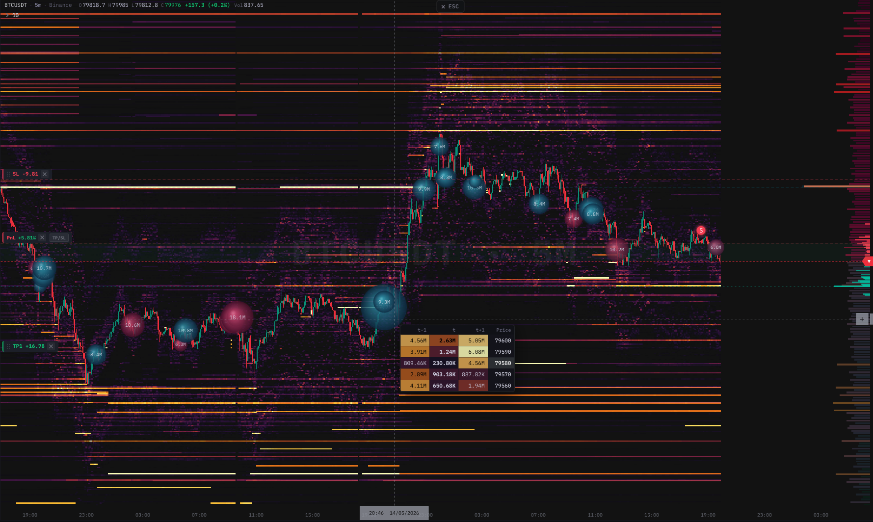 Real BTC/USDT chart with all five patterns visible simultaneously — resting walls above and below price, an active liquidity vacuum in the middle range, and stacked accumulation building underneath.
This guide assumes you already understand what a depth heatmap is and how it gets rendered. If not, start with Trading Chart with Depth Heatmap: Complete Guide first.
Pattern 1 — The resting wall
Visual: A horizontal bright stripe (orange or red) that persists across many time columns at the same price level.
What it means: A market participant has placed a large limit order at that price and is leaving it there. The longer the stripe, the more committed they are. A wall that has held for one hour is a wall the market has already failed to break, which is the strongest support/resistance signal a chart can give you in real time.
Trade setup
When price approaches a wall:
- First approach: Expect a bounce. Walls almost always hold the first time. Tighten stops if you are trading against the wall.
- Second approach within the next 30 minutes: Lower probability of bouncing. The wall is being tested.
- Third approach: If the wall is still there, the holder is serious. Wait for the wall to either absorb the test (massive volume into the level with no break) or get pulled.
The single most reliable signal on a depth heatmap is the wall disappearing. When a wall that has held for an hour suddenly vanishes from the heatmap — within the same time column — price breaks through within seconds, almost without exception. Pulling a wall is the holder's confirmation that they no longer want to defend the level.
Why it works
A wall is public information. Every algo on every exchange can see it. When the wall is large enough to matter, the market collectively decides "either the holder takes the order flow, or they pull and we run". There are no third options because there is no reason for a serious wall holder to keep an order there if they no longer want the fill.
 Close-up of a resting wall on the depth heatmap. The bright stripe is a single large limit order sitting at a constant price for many minutes — the longer it persists, the higher the conviction that the holder will defend it.
Pattern 2 — The spoof flash
Visual: A bright stripe that appears for less than 30 seconds and disappears before price reaches it.
What it means: Someone is faking a wall to scare the opposite side. Spoofing is illegal in regulated markets and prosecuted in equities and futures (Sarao, Coscia, JPMorgan have all paid eight- and nine-figure settlements). In crypto, regulation is patchy and spoofing remains extremely common, especially around round numbers and during low-liquidity hours.
Trade setup
The spoofer's playbook: place a large fake bid below current price → retail panics short → spoofer accumulates the dump → pulls the fake bid → price reverses up → spoofer exits long.
You can trade either side. The simpler side is with the spoofer:
- When you see a fresh wall appear far from price (15–50 ticks away in a low-vol environment), wait two minutes.
- If the wall is still there and price has not approached, this is a real resting wall — back off.
- If the wall disappears within 30–60 seconds without price coming close, this is a spoof.
- The direction the spoofer is trying to scare is the direction you fade. A fake bid scares shorts → fade by going long after the spoof resolves.
This pattern alone has put more capital into professional desk traders' accounts than any indicator ever invented. It is the original "smart money signature" you can see without an institutional terminal.
Why it works
Spoofers are running known algorithms. Their order placement, refresh, and cancellation patterns leave a signature on the heatmap that is almost impossible to obscure. Once you have identified two or three spoofs at the same price band, you have effectively reverse-engineered that algorithm's behaviour and can fade it before retail catches on.
Pattern 3 — The iceberg refresh
Visual: A faint horizontal dotted line at a single price level, persisting for many minutes. Each "dot" is a small visible slice that gets consumed and immediately refilled.
What it means: A large hidden order is being executed in small chunks. The full size is not shown — only the visible slice is. Every time the visible slice gets eaten, a new slice appears. Iceberg orders are how institutions and prop desks fill size without telegraphing it to the rest of the market.
Trade setup
Iceberg orders almost always defend a level. If you see iceberg refresh at $66,800 for 20 minutes:
- The buyer wants substantial size at that price.
- Stops sitting just below ($66,750) are about to get harvested.
- After the stop run, price has high probability of bouncing back through $66,800 because the iceberg is still there.
The classic iceberg trade is the stop-run-and-reclaim:
- Wait for price to break below $66,800 (stop run).
- Watch the iceberg refresh continue below the previous level (the buyer is now accumulating cheaper).
- Enter long on the first reclaim back above $66,800.
- Stop just below the new iceberg level.
This is one of the highest-conviction setups in microstructure trading because you are entering with the largest aggressor in the orderbook.
Why it works
Iceberg orders are placed by participants who genuinely want fills, not by spoofers who want movement. The iceberg refresh is the most reliable signal that "someone with size wants to be long here", and the market eventually agrees with them — because they keep buying every dip without panicking.
Pattern 4 — The liquidity vacuum
Visual: A dark band sandwiched between two bright bands. The dark band may span 20–100 dollars of price range with almost no resting orders.
What it means: There is nothing to absorb market flow in the dark zone. A single decent-size market order can drive price through the entire vacuum in seconds, because there is no opposing liquidity to stop it.
Trade setup
When you see a clear vacuum between $67,200 and $68,000, with walls at $67,000 and $68,500:
- If price breaks $68,500 going up: It will not stop until $68,000 is also taken, because the vacuum sucks price through. Target the next wall above $68,500 (whatever that is) and stop just below $68,500 (becoming new support after the break).
- If price breaks $67,200 going down: It accelerates to $67,000 within seconds. Short-bias entries make sense as soon as $67,200 is decisively lost, with stop above the broken level.
Vacuums are the chart's way of telling you where price wants to be next. Trend continuation through a vacuum is the highest-probability move on any depth heatmap.
Why it works
Vacuums exist because no participant wants to commit liquidity to a price range. Sometimes it is because the range is "in transit" between two consensus levels. Sometimes it is because everyone is waiting to see if a breakout is real before placing orders. Either way, once the breakout happens, the price has nothing to slow it down.
Pattern 5 — Stacked accumulation
Visual: Multiple closely spaced bright stripes stacked below the current price (or above it for distribution). Each stripe is at a slightly different price level, forming a ladder.
What it means: A market maker or large discretionary trader is building a ladder of limit orders to fill size without slipping the market. They will buy a little at $66,800, a little at $66,700, a little at $66,600, all sized to be hit during normal volatility. The ladder is patient capital.
Trade setup
Stacked accumulation below current price is a trend-continuation buy signal:
- Confirm the ladder is real (it persists across many time columns and the levels do not disappear all at once).
- Wait for the first ladder rung to get hit (price ticks down into the highest stripe).
- Look for a quick rejection — usually a wick down into the level then a fast recovery.
- Enter long on the rejection, stop below the next ladder rung, target the next visible wall above.
The opposite (stacked distribution above current price) is a short signal at resistance, but distribution ladders are rarer in crypto because most participants are net-long-biased.
Why it works
A ladder is the signature of a participant who wants fills but is price-disciplined. They are not chasing. They are letting the market come to them. When the market does come, they buy, and they keep buying as it dips. This kind of behaviour does not lose, because the participant is sized to handle drawdown and will not flinch on a single bad candle. The market eventually rotates back up to where they bought, because the rest of the market sees the same ladder and front-runs the bounce.
Combining the patterns: the institutional read
Real heatmaps do not show one pattern in isolation. They show all five at once, layered. Here is what an experienced reader sees in a typical BTC/USDT setup:
- Below current price: a stacked accumulation ladder from $66,800 to $66,200 (someone is buying the dip).
- At $67,200: an iceberg refresh that has held for 45 minutes (defended level).
- Between $67,500 and $68,000: a vacuum (next move zone).
- At $68,500: a resting wall that has held for two hours (next resistance).
- At $69,200, briefly: a 20-second spoof that just disappeared (someone tried to fake resistance).
The institutional read is: buyers are dominant (accumulation + iceberg below), vacuum points to upside (next move likely up), real resistance is $68,500 (the wall), spoof at $69,200 confirms bearish desperation (they had to fake resistance because there is none real).
That is one screen, five patterns, one trade thesis. Long bias from current price, target $68,500, stop below the iceberg at $67,200.
Practising on real data
The fastest way to internalise these patterns is to watch a live BTC/USDT depth heatmap during NY open (12:30 UTC) and again at the Asia open (00:00 UTC). Both sessions reliably produce spoofs, walls being pulled, and vacuums getting filled. Within two weeks of daily 30-minute sessions, the patterns become automatic.
You can run a free live heatmap at the kline-orderbook-chart demo — or embed one in your own dashboard using the 50-line implementation from the introduction guide.
What to read next
- Trading Chart with Depth Heatmap: Complete Guide — start here if you do not yet understand the heatmap rendering model.
- How to Read the DOM Ladder — the live price-by-price ladder behind the heatmap: where these same walls and absorption events show up tick-by-tick.
- Footprint Chart vs Candlestick Chart — the third dimension that pairs perfectly with the heatmap.
- Liquidation Heatmap: A Research-Led Guide to Trend Trading — how to read the liquidation heatmap as fuel for the prevailing trend and overlay it on top of the depth heatmap.
Want to try it? The 30-day trial of kline-orderbook-chart unlocks every indicator and every layer mentioned in this post. The pricing page has the plan matrix.