How to Read a Footprint Chart: 8 Patterns Every Trader Must Know
Learn how to read a footprint chart in practice. Eight order-flow patterns — absorption, stacked imbalance, delta divergence, exhaustion, unfinished auction, HVN, POC rotation, and supportive-vs-fading delta — with examples and trader interpretation.
The footprint chart shows you trade volume at every price inside a candle. But the cells themselves are not the read — the patterns the cells form are. A footprint is information dense; if you scan it cell-by-cell, you will drown. Experienced order-flow traders learn to spot eight or nine repeating shapes, and the rest of the chart fades into background.
This guide walks through the eight patterns that show up most often, and what each one typically means. They map directly to the signals our engine emits (ABS, IMB, DIV, EXH, UA, HVN) plus two structural reads — POC rotation and supportive-vs-fading delta — that experienced traders pick up by hand. By the end you will have a checklist you can run on any footprint bar in under five seconds.
This is a tactical guide. If you are new to the chart type itself, start with What Is a Footprint Chart? The Complete Guide and come back.
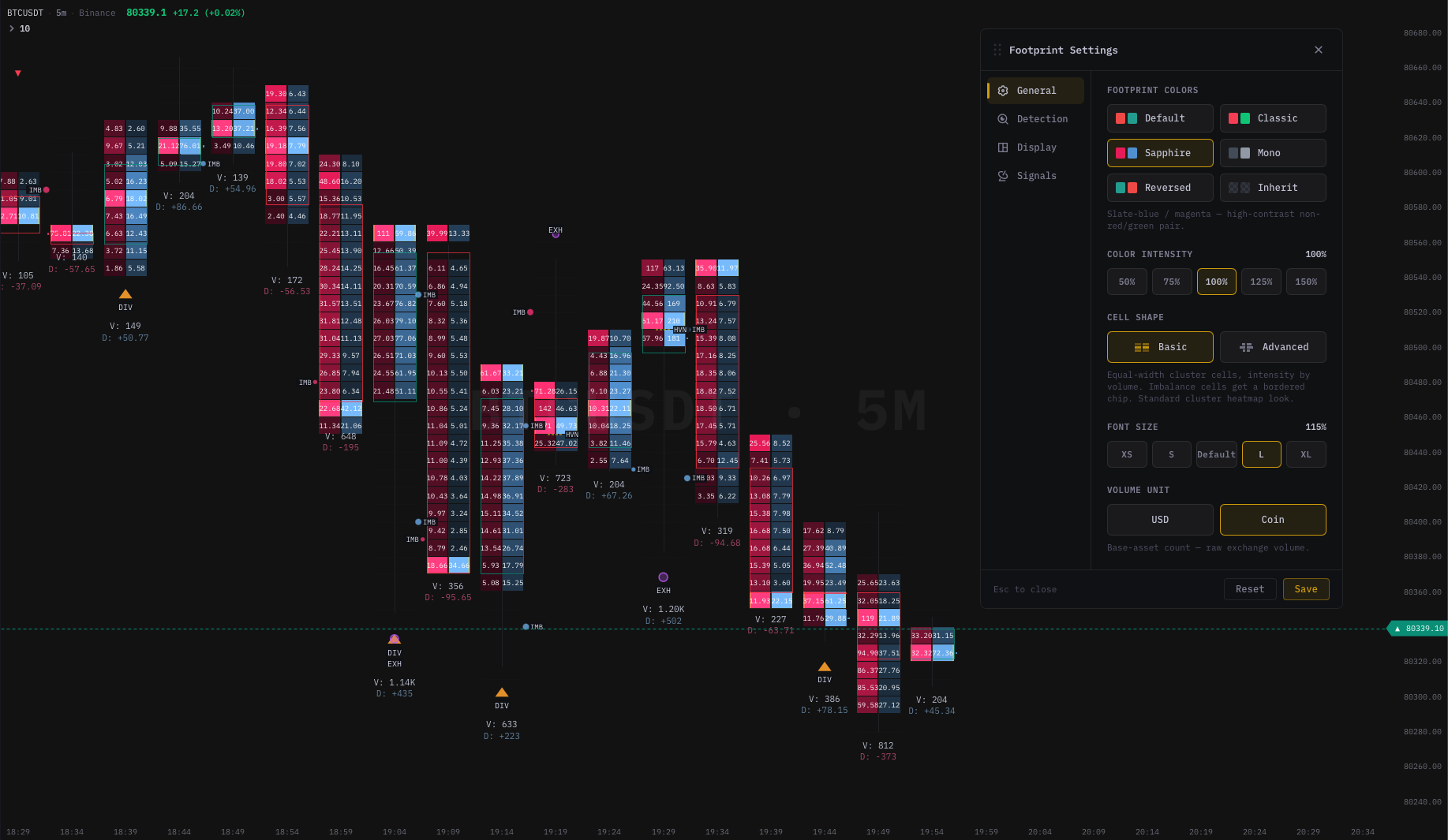 A footprint bar with all signal overlays enabled. Every pattern in this guide is visible in this view if you know where to look.
How to set up your eye before reading
Before you read a single cell, anchor your attention on three things. This is non-negotiable; skipping it makes every read meaningless.
- Higher-timeframe bias. Is your instrument in a trend, range, or chop on the timeframe you trust? The same footprint pattern means opposite things at the top of a range versus in the middle of a breakout.
- The level you care about. Footprints earn their keep at something — a prior swing, VWAP, a daily extreme. If the bar is in open space, the read is less useful.
- Volatility. Wide-range bars need wider tick aggregation; quiet markets need finer aggregation. Recheck your tick setting if the cells look noisy or empty.
With that frame in place, you can scan for patterns. The order below is roughly the order experienced traders use — structural reads first (POC, delta direction), then engine-detected events (ABS, IMB, DIV).
Pattern 1 — POC rotation
The POC is the price row inside a bar with the highest total volume. Each bar produces one. Track how the POC moves bar-to-bar and you have a very fast read of where the market is settling.
What to look for:
- POC drifting up bar-to-bar in a green sequence — value is migrating higher, buyers in control of the auction.
- POC drifting down in a red sequence — value migrating lower, sellers in control.
- POC flat across multiple bars at the same price — balance, range conditions. Often precedes a breakout when one side eventually wins.
- POC suddenly opposite the candle direction — the bar closed green but the POC sits near the low (or vice versa). This is your first hint of absorption or fade.
Trader interpretation: POC rotation is the cheapest read on a footprint. You do not need to scan every cell — just track where the high-volume row sits. Many discretionary traders treat persistent POC rotation in trend direction as continuation, and POC opposite the close as a yellow flag.
Caveat: Single-bar POC means very little. The signal is in the rotation across bars. If your platform offers a multi-bar profile (VRVP, TPO), use it together with intrabar POC for stronger reads.
Pattern 2 — Supportive vs fading delta
A green candle with +5,000 bar delta is very different from a green candle with −2,000 bar delta. The first means buyers aggressed and price went up — straightforward. The second means price went up despite aggressive selling — buyers were absorbing.
What to look for:
- Supportive delta: candle direction and bar delta agree. Green close + positive delta, red close + negative delta. The simplest, most common case. Continuation likely if structure supports it.
- Fading delta: candle direction and bar delta disagree. Green close + negative delta, red close + positive delta. Almost always worth investigating — someone is absorbing on the losing side.
- Delta concentrated where the close went: open at $X, close at $X+50, and the bulk of positive delta happened in the upper half — buyers genuinely pushed.
- Delta concentrated where the close did NOT go: open at $X, close at $X+50, but most of the positive delta was in the lower half. Buyers aggressed at the lows; price drifted up on thin volume in the upper half. Weaker than it looks.
Trader interpretation: Supportive delta confirms continuation. Fading delta is your primary early warning of a reversal — even before the engine fires an explicit ABS or DIV signal. Many experienced traders run this scan as their first pass on any new bar.
Pattern 3 — ABS (Absorption)
This is the most-talked-about footprint pattern, and the engine flags it explicitly. The setup: one side aggresses heavily near an extreme of the bar, but price does not follow through in that direction by the close.
Bullish ABS (engine logic):
- Strong ask-initiated volume near the low of the bar (aggressive sellers hit the bid hard).
- Bar closes bullish despite that selling.
- Read: passive buyers absorbed the aggressive sell-flow. The sellers fired their ammunition and price held.
Bearish ABS:
- Strong bid-initiated volume near the high of the bar (aggressive buyers lifted offers hard).
- Bar closes bearish despite that buying.
- Read: passive sellers absorbed the buy-flow. Buyers fired and price faded.
Trader interpretation: Absorption is one of the cleanest "level held / level rejected" reads in order flow. When it fires at a structural level — prior swing, VWAP, range boundary — many traders treat it as a hint that the level is defended. The usual follow-up is to wait for the next bar to confirm: if the absorption was real, the next bar should not break the absorption extreme.
Caveat: Absorption near the low of a falling knife is not the same as absorption at a known support level. Context determines whether the absorber is a meaningful participant or just somebody catching a falling block. News spikes and gaps can also produce false absorption prints.
Pattern 4 — IMB (Stacked Imbalance)
A single imbalanced row — buyers at price P dwarfed sellers at price P by 3× or more — is common and unremarkable. What matters is when multiple consecutive rows show the same lopsidedness. That is a stacked imbalance.
What to look for:
- Multiple adjacent rows tinted green on the buy side — stacked buying. The engine paints a
]bracket on the right edge of the candle. - Multiple adjacent rows tinted red on the sell side — stacked selling. The engine paints a
[bracket on the left edge. - The zone extent — top and bottom price of the stack — marks a level worth watching for retest.
Trader interpretation: Stacked imbalances are commitment signals. Aggressive flow does not happen on multiple consecutive ticks by accident. A 3-row stack in a liquid instrument can be background noise; a 5-row stack with a 10×+ ratio is a clear footprint of one-sided pressure.
- With trend: stacks in the trend direction support continuation.
- Against a level: stacks into a barrier often precede a break or a clear rejection, depending on whether the next bar confirms.
- On a retest of the stack: many traders treat the zone as support (buying stack) or resistance (selling stack) on the first revisit, with a stop on the far side of the zone.
We unpack the detection rules and how to calibrate them in Stacked Imbalances: Setup, Reading, and Trading.
Pattern 5 — DIV (Delta Divergence)
A divergence is when price makes a new short-term extreme but bar delta disagrees. Higher high with negative delta. Lower low with positive delta. The price did what it did, but the aggression did not back it up.
What to look for:
- Bearish DIV: new bar high (above the recent N-bar window) but negative bar delta — the new high was made on net selling. Possible weakness.
- Bullish DIV: new bar low but positive bar delta — the new low was made on net buying. Possible exhaustion of sellers.
- Divergence across multiple bars: even more telling. Three consecutive higher highs with sequentially weaker delta is a classic order-flow exhaustion pattern.
Trader interpretation: DIV is a non-confirmation warning. The trend is still intact by price, but the order flow is not feeding it. Discretionary traders use DIV in two ways:
- As a fade signal near a known level, with confirmation (price closing back inside range, structure breaking).
- As a trim signal in existing trend positions — DIV is often the first sign to lock in profits.
Caveat: Divergence can persist in strong trends. Markets can stay one-sided longer than divergence suggests. DIV without a level or structural break is a weak signal; DIV at the third test of a major level with confluence is a strong one.
Pattern 6 — EXH (Exhaustion)
Exhaustion is a stylized "effort vs result" mismatch. Very high volume bar plus a large wick relative to range, plus a directional close consistent with counter-pressure. The engine reads it as: someone fired a lot of size and got rejected.
What to look for:
- A bar with volume well above the recent N-bar average.
- A wick (upper or lower) taking up a large fraction of the range.
- A close on the opposite side of the wick — into the body, not into the spike.
Trader interpretation: Exhaustion often shows up at swing extremes — both tops and bottoms. The narrative is straightforward: aggressive players pushed price to the spike, the rest of the market did not follow, and the bar closed back. The followup question is always what happens on the next bar? — a confirmed exhaustion does not retest the spike easily.
Caveat: High-volume continuation bars can also have long wicks (think a strong bull move where the bar tests support intrabar then closes up). Context — especially trend and level — determines whether the wick is exhaustion or just normal intrabar action.
Pattern 7 — UA (Unfinished Auction)
At the exact high or low of a bar, normally you would expect to see two-sided trade — both aggressive buyers and aggressive sellers transacted at the extreme tick. An unfinished auction is when only one side traded at that tick. For example: bids printed at the high, but no asks. The auction did not "complete" at that price.
What to look for:
- The very top row of the bar shows volume on only one side (e.g. only bid-initiated, no ask-initiated).
- Equivalent at the bottom row.
- The engine paints a small marker on the open extreme.
Trader interpretation: Some traders believe price tends to revisit unfinished auctions to "complete" them. The market did not fully transact two-sided at the extreme, so the level remains a magnet. Others treat UA as a soft bias only — useful as part of a stack of evidence, not as a primary signal.
Caveat: Tick granularity and aggregation change UA appearance. At a coarse aggregation, a UA disappears because the row contains both sides of the original micro-row. Calibration matters; do not change tick aggregation mid-session and expect UA reads to stay consistent.
Pattern 8 — HVN (High Volume Node)
The engine flags a bar as HVN when its POC volume is significantly larger than the recent average POC size — a standout high-volume price within the recent window.
What to look for:
- A POC row drawn with extra thickness or a marker indicating it is HVN-flagged.
- The volume number at that level is noticeably larger than POCs from surrounding bars.
Trader interpretation: HVNs are future magnets. When the market revisits a price where significant size traded before, it tends to pause or reverse there. Many traders mark HVN prices on their chart and treat the level as a soft support / resistance.
Caveat: A single-bar HVN is local. On a 1-minute chart it may only mean something for the next 30 minutes. On a 1-hour or 4-hour chart, HVNs can persist as levels for days. The longer the timeframe of the HVN, the longer it stays relevant.
Putting it together — a 5-second scan
When a new bar closes, run this scan in roughly this order:
- Where is the POC? Top, middle, bottom of the bar? Aligned with the close direction or opposite?
- What is the bar delta? Big positive, big negative, near zero? Aligned with the close direction or opposite?
- Are there visible imbalance brackets? A
]on the right or[on the left edge of the candle? - Did the engine fire any signal labels? ABS, IMB, DIV, EXH, UA, HVN — all teleported to the bar if detection is on.
- Where does the bar sit on the chart? Mid-range, at a key level, breaking out?
After a few hundred reads this becomes automatic. You stop reading cells and start reading bar shapes. That is when the footprint becomes valuable as a real-time tool rather than a post-mortem novelty.
Combining footprint with other views
A footprint is one of three core order-flow views. The complete order-flow stack looks like this:
| View | What it shows |
|---|---|
| Footprint | What actually traded inside each bar, split by aggressor. |
| Orderbook heatmap | What resting limit liquidity is sitting at each price right now (and historically). |
| CVD / Cumulative Delta | The running sum of bar delta across the session. |
Each answers a different question. The footprint shows aggression as it executes. The heatmap shows where liquidity is currently waiting. The CVD shows the net of aggression over time. Together they form a complete picture of the orderflow at any moment.
For a deeper dive on the heatmap side of the stack, see How to Read an Orderbook Heatmap — 5 Patterns Every Order Flow Trader Must Know.
Common reading mistakes
| Mistake | Better approach |
|---|---|
| Reading the footprint first and then looking for a setup | Anchor on structure and level first; use the footprint to confirm or reject ideas, not to generate them |
| Treating signal labels as buy/sell triggers | Treat them as helpers. Combine with level, trend, and risk before acting |
| Ignoring tick aggregation | Wrong aggregation = misleading rows. Set it once per instrument and stick with it |
| Chasing every imbalance | Most imbalances are noise. Only stacks at structural levels matter |
| Confusing bid/ask labels | Bid-initiated = aggressive buys (someone lifted the ask). Memorise this once |
| Trading on a single bar | Footprint patterns are hypotheses until the next bar confirms |
Practice routine
The fastest way to internalise these eight patterns is replay. Pick a single instrument and a single session — for example, BTCUSDT during US session — and replay the day bar-by-bar. For each bar, before clicking forward, write down:
- The strongest pattern you see (or "nothing").
- What you think happens on the next bar based on that pattern.
- The level context.
Click forward and verify. Do this for 50 bars per session, ten sessions in a row. By session ten the pattern reads will be near-automatic, and you will have a journal showing which patterns work for your instrument and your timeframe.
Tools come and go. Replay discipline is what compounds.
Where to go next
- Stacked Imbalances on a Footprint Chart: Setup, Reading, and Trading — calibrate the most-used footprint signal for your instrument.
- Footprint Chart vs Candlestick Chart: Why You Need Both — when each view earns its keep.
- How to Read an Orderbook Heatmap — the companion view to the footprint.
- Trading Chart With Depth Heatmap: A Practical Guide — combine footprint with heatmap in one chart.
Patterns rendered with kline-orderbook-chart — 60 fps footprint with built-in ABS / IMB / DIV / EXH / UA / HVN detection. Free for development; commercial licences from $890/yr.