General Settings
Chrome-only settings for mrD-Smart Ranges — pick the display theme (Dark, Light, Monochrome) so the Order Block / FVG / Liquidity colour scheme matches your chart, and tune the metrics text size to fit screen DPI. None of these settings affect signal logic.
General Settings are the chrome layer of mrD-Smart Ranges — they only change how zones look, never how they are computed. There are exactly two controls: a theme selector (Dark / Light / Monochrome) and the metrics text size. The recommended sequence is to pick the theme that matches your chart palette before adding any indicator, and to bump the text size up by one step if you trade on a 4K or HiDPI display.
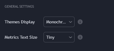 The full General Settings group inside the study's input panel. Both controls live near the top so the visual setup is the first thing you tune after adding the indicator.
Themes Display
The theme controls the colour of the OB rectangles, FVG strips, liquidity highlights, and the BUY / SELL triangle / arrow markers. Three modes:
| Mode | When to use | What it does |
|---|---|---|
| Dark (recommended) | Dark chart background (the default in Workspace Setup). | High-contrast cyan / red OB rectangles, bright BUY / SELL triangles, FVG strips at moderate opacity so the underlying candle stays readable. |
| Light | Light chart background. | Inverted palette tuned for white backgrounds — same hues, lower brightness so the OBs do not glare on a white chart. |
| Monochrome | You want to see price action clearly, with OB / FVG zones acting as a quiet background reference rather than the focus. | OBs render as light-gray rectangles, FVGs almost transparent, signal markers reduced. Useful when you are reading raw price structure and only want the zones for context. |
The recommended pairing is Dark theme + the chart palette from Workspace Setup — that combination is the one the screenshots throughout this documentation use. If you switch chart palette later, come back here and re-pick the theme to match.
A common mistake is leaving the theme on Dark after switching the chart to a light background — the OB rectangles end up too bright and visually fight the chart. Theme is a per-indicator setting (TradingView does not auto-sync indicator chrome with the chart palette), so it needs to be set manually.
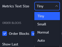
Metrics Text Size
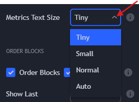
The metrics text size scales the label font used on:
- Order Block volume and % weight labels (
12.4M (34%)style — shown whenShow Metricsis ON, see Order Blocks). - BSL / SSL liquidity line labels.
- The
BUY/SELLtext inside the signal triangles.
Pick the size that stays legible on your monitor without crowding the chart:
| Screen | Recommended start | Notes |
|---|---|---|
| 13-inch laptop, 1080p | Small or Normal | The default sizing fits well; bump up only if you find yourself zooming into labels. |
| 24–27 inch, 1440p | Normal | The baseline for most desktop setups. |
| 27 inch+ 4K, HiDPI | Large | At 4K the default labels become hard to read at arm's length — one step up restores parity. |
| Mobile / tablet (TradingView mobile app) | Tiny | Mobile screens can not afford the larger labels — they crowd the candles. |
The setting only changes label rendering, not how many labels are drawn. If the chart is crowded with too many OB / FVG labels, that is a Show Last problem (cap how many zones the engine displays) and not a font-size one — see the relevant module pages.
Quick recap
- Pick the theme that matches your chart palette — most users run
Dark. - Bump the font size if you read on a 4K display; leave it at default otherwise.
- Neither setting changes signal logic, OB / FVG detection, or alert behaviour — they are purely visual.
Where to go next
- The OB engine that produces the primary BUY / SELL triangle: Order Blocks.
- The FVG layer that adds the
•BUY/•SELLarrow: Imbalance Concept. - The structural Buy-Side / Sell-Side liquidity layer: Liquidity Concept.
- Back to the study overview: mrD-Smart Ranges.